Rethinking Language
25 / 02 / 2021
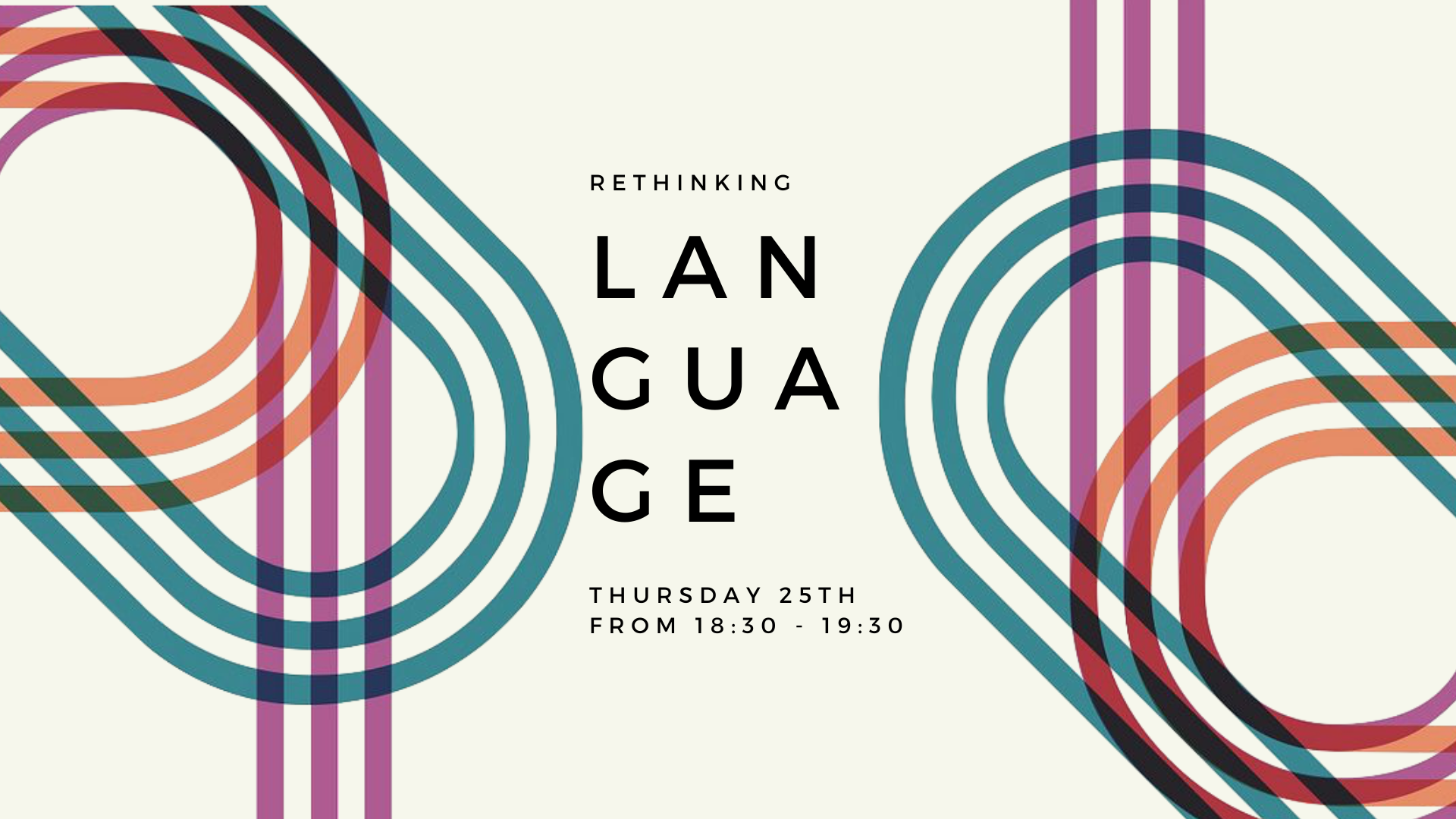
The post below will showcase my designs for “Rethinking Language”, along with some information about the process behind these designs and the inspiration I drew from creating them. I will also showcase the description I wrote to accompany the designs.

THE INSPIRATION BEHIND
THE INSPIRATION BEHIND
I felt that, for this topic specifically, there were many different direction in which I could have taken my design - but I wanted something different. I wanted my designs to reflect a quality of language that one might not consider when discussing “language”.
This is why I went for calligraphy. I wanted to go in the direction of shape and movement of the hand - to symbolism.
I was particularly happy with my decision to take the designs into this direction because I felt it also brought together the aspect of the topic which is language with my task in hand - which is design. Calligraphy is where language and design meet.
The posters above served as inspiration. I was drawn and inspired by the different ways in which they represented letters and arranged them on the page.
I found the first and fourth posters to be quite clever in this particular task. The smokey letters of the first, arabesques resemble the language of Arabia. It is elegant, enticing, and mysterious. One can almost smell the musky spice of the smoke. It has movement yet it is rigid - this is an admirable quality of this design.
On the other hand, we have the fourth design. A wink to the origins of calligraphy - this design resembles the rough, confident trace of a child. Nevertheless, the most admirable quality of this design is its texture. I can feel the trace of the letter as if I’d written it myself - a regression to when one was younger and wrote senseless words onto a page with crayons.
So, I figured my designs must share at least some of these qualities.
The Instagram Post
For Rethinking Langauge, I wanted to bring attention to calligraphy, shapes, geometry, and most of the base aspects of language which are so commonplace that we tend to overlook them.
I was particularly drawn to the idea of superimposing shapes and letters on top of one another to make them look like they are literal living things sitting on top of each other - crushing each other.
I did this as a way of symbolizing the heaviness and vastness of a topic such as a language. I wanted to bring attention to the importance that language has to human connection and the survival of our species as a whole, and how sometimes a couple of words stringed together hold a lot of weight
- language is a weapon.


